Simplicity Is Key to Go From Insight to Impact
How we used storytelling and design to make a customer journey simple.
Share

By Kelly Pellico
Why are great business insights often not utilized? The primary reason is the way insights are delivered – in uneasy-to-digest formats that are difficult to comprehend. Though progress has been made over the past two decades, we’ve all heard the stories of 100 page reports with data dumped into overly complicated tables or buried inside illegible charts.
The best way to prevent great insights from going nowhere is to focus on strong storytelling and design. But the need for these two essentials has been so well-recognized now that the words themselves have become overused. Their overuse doesn’t render them meaningless, but what may have gotten lost in the fray is the core purpose behind them. It’s important to create engagement so that the insights break through but equally important, if not more, is the need for the stories we tell and the design we use to simplify the insights. In an ever-evolving, overly-complex world, simplicity is the key to making sure people use valuable research to change and better their business.
In a recent example, a financial services company turned to us to help simplify their customer journey. Mind you, they weren’t coming with a blank slate. They had a wealth of great customer information as well as insight into the various ways they interacted with the brand. In fact, the company already had several different journeys that represented a spectrum of customer perspectives. The problem was that today’s journey has become incredibly complex and the visualizations used reflected that. They were overwhelming. As a result, good research had fallen by the wayside and was seldom used.
The challenge for us was to synthesize the journeys they had already compiled, and to then layer in new insights from an additional audience, all while simplifying the complexity to ensure the insights would be useful.
To give you a sense of how overwhelming these journeys were for our client, we created replicas, disguised for confidentiality, that you can view below:


These are not without merit. Their information is thorough and it successfully captures the nuance of the customer journey at each stage. The layout is also organized and tidy. But the problem is, there’s far too much information packed onto each page. The layout feels daunting, creating an instinctual desire to look away.
Our ultimate goal in synthesizing the journeys was to simplify them. Rather than show all the information, we searched to find the story buried beneath it. Then, we created a design that leaned into and complimented the simplicity we’d unearthed. Whenever we present insights simply, they become accessible and useful, which positively impacts any business.
Here’s the breakdown we used to approach this challenge, translated into three tips that can help you do the same:

Establish a Storytelling Hierarchy
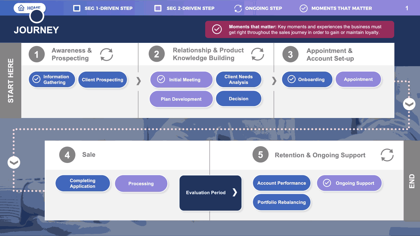
Simplify by distilling the overwhelming journey data down to key moments and touchpoints that have the greatest impact or bear the most weight. Setting a clear focal narrative is the first line of defense to ground your stakeholders. Every story has a primary character or protagonist that leads the audience through the narrative. This first layer is your story’s protagonist. Here is the journey in its simplest form:

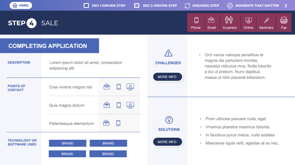
Build a Supporting Narrative for the Key Moments
A story also has supporting characters and subplots that weave the narrative together. So that’s what we built next. For each key moment, we refined the insights into a clear, simple story, describing what it is and the touchpoints used, while highlighting the challenges and solutions. This supportive layer adds nuance in a clear and focused way. Instead of packing all the information onto one page, it can now be absorbed moment by moment. The top layer shows how it all fits together, and this sub-layer provides space for the deeper information to be discovered and clarified.
Design for Interactivity
In marketing, we always talk about the right place, right time. Creating an interactive journey map lets stakeholders find the information they need, when they need it. Yes, we’re talking about simplifying the complexity of data, but let’s not forget the complexity of our working culture today. As we navigate endless cycles of back-to-back meetings, always on call and exhausted from our reliance on digital screens, it’s easy to miss the forest through the trees. But by creating an interactive map, not only have we simplified and added structure to the narrative, we’ve removed the overwhelming effect of too much information. This allows stakeholders to quickly find only what’s most relevant to them, and at the moment they choose. They simply click from the main journey, using a key moment, and are immediately transported to its supporting story. Stakeholders who can navigate quickly to needed information are better able to determine what to do next.
We use a wide array of techniques to simplify the complex, such as intuitive storytelling structures and flows, or the use of metaphors or frameworks. No matter what storytelling device you choose, the important takeaway is to ensure insights are delivered in a way that feels accessible and easy to use. Distilling the complex to its simplest form will always create the greatest impact.